Friday, November 25, 2011

Interesting Design Problems

Bookcases
  • My book collection is currently housed in two IKEA Billy bookcases, but I had an incredibly difficult time finding bookcases that I was satisfied with. Before trying IKEA, all of the options that I was able to find were made of very poor quality particle board, had very short shelves, had a lot of needless flourishes, were low capacity, were outrageously expensive, or were incredibly ugly. Only the cheap bookcases seemed as if they had been made to hold books; more expensive bookcases were clearly just for show and form most certainly did not follow function. The Billy bookcase is very plain, simple and clean, with shelves long enough (and strong enough) to fit several thick books on each one. I do love them, but they are far from perfect and I am still seeking a more elegant, effective bookcase.

Storage and Furniture
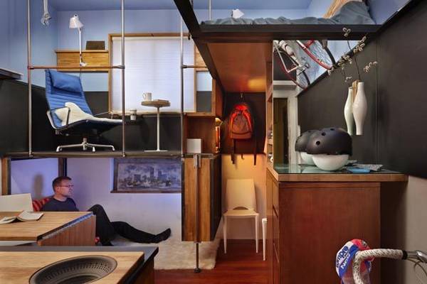
  • I am intrigued by custom-designed, purpose built furniture and storage for meeting more individualized needs.


Kitchen Appliances
  • I strongly believe that most kitchen appliances are incredibly poorly designed. Most of my ire is reserved for dishwashers. Loading most dishwashers is infuriating- poor layouts leave enormous gaps of wasted space. Asone of the least energy- and water-efficient appliances in the house, each cycle of the dishwasher should be able to clean as many dishes as possible. The proper balance needs to be struck between maximizing capacity and achieving the proper placement that will allow the dishwasher to do its job. I also dislike the knobs on stoves and ovens, whose form does not adequately explain their function. Words like "Left front" should not be required to differentiate the purpose of each knob. Potentially dangerous accidents happen in the kitchen; it is especially necessary that an object's form should communicate its function.

Packaging
  • Packaging is often wasteful and nearly always frustrating. Unpacking internet orders is sometimes like playing with Russian nesting dolls: a clamshell in a bag in a box in a box. This doesn't only hurt the environment; many people are injured while opening plastic packaging.

A high-powered, small-footprint vacuum cleaner
  • Many individuals do not have the room to store a large, upright vacuum cleaner, but most of the small vacuum cleaners available are so weak they are hardly worth using. A small vacuum cleaner with enough suction to be effective would fill a niche market that is not being effectively served.
Thursday, November 24, 2011

Gamification


http://gamification.co/
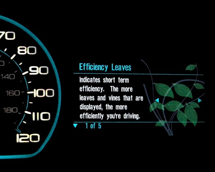
This video was my second exposure to the concept of gamification, after reading Jane McGonnigal's "Reality is Broken." The more I hear, and the more I think about the more convinced I am in the power of gamification. It is such an inspired idea to design the world around us to take advantage of the motivating power of games. For example, the video explains the Ford "EcoGuide" built into the dash of Ford hybrids, featuring a vine which grows when the car is driven in a way that conserves gasoline and shrinks when it is driven more aggressively.

The video also discusses a game called "Speed Camera Lottery," in which speed cameras do not only detect speeders and send them tickets, they also keep track of drivers who pass going under the speed limit. Speeders receive tickets, while everyone else is entered into a lottery to win the ticket fees. The psychology of games, as well as the partial reinforcement effect combine to make this method highly effective, dropping the average speed by 20% in areas where such speed cameras are installed. I was very intrigued by this concept because it so clearly shows what effective tools product and system design can be for social engineering.

Wednesday, November 23, 2011

Mosaic


The second half of my high school crafts class was spent on mosaics. I decided to try to copy a photo that I took in Wyoming the year before:
I started planning the layout on a sheet of masking tape, so that I could lay out all of the pieces that I wanted to use without worrying about any getting lost.
I then had less than an hour to transfer all of the pieces into a clay tablet before it began to harden.

Copper Jewelry Box


The first half of my high school crafts class was about patterns, shapes and metalwork. We first started by creating five shapes, and combining them into as many patterns as we could think of.
Once I chose a pattern, I decided that I wanted to use it in a small metal box. The sides of the box would fold up, and the lid would open and close on a makeshift hinge. A manilla mock-up was made before I was allowed to start on the metal, but I don't have any photos of it.
The bottom of the box and the hinge for the lid
The lid and pattern (tracing paper rubber-cemented to the metal)
The finished product


Monday, November 21, 2011

AP Physics Design Project: Vertical Axis Turbine

The capstone of my high school engineering class was a design project. In teams, we were responsible for designing and building a project, but it could be anything we liked. There were several catapults and trebuchets, a go-kart, and in the case of my team, a wind turbine. As can be seen in the photo above, my friend and I designed and prototyped many different designs before choosing one.


Our first challenge was to turn a microphone stand into a support structure. For our initial plan to create a horizontal axis wind turbine, this support consisted of PVC pipes and an elbow. A small dc-motor was then mounted inside of the pipe to generate power from the rotation of a central hub. We made two different types of blades, flat balsa wood blades, and curved pvc blades. Neither provided a fast enough rotational velocity to generate enough power without gearing, so we settled on a vertical-axis design that would allow us to use a smaller radius turbine.

Sunday, November 20, 2011

Joanna Blakely: Lessons from Fashion's Free Culture


In this TEDTalk, Johanna Blakely discusses the effect that the lack of copyright protection has had on the fashion industry. As "utilitarian" objects, clothing designs are not eligible for copyright in the US. Only brand logos are protected by law, so it is completely legal for counterfeiters to reproduce a design. While it is commonly believed that without ownership, their is no incentive to innovate, Johanna Blakely makes the opposite argument. Not only is there incentive to innovate, there is an increased incentive to innovate faster. It becomes necessary to stay ahead of the counterfeiters, and to design in a way that makes a product particularly difficult to copy. Designers strive to create designs as part of a certain aesthetic each season; these designs work best within this aesthetic. This is very similar to the world of comedy: jokes cannot be copyrighted, so comedians create an onstage persona to deliver their jokes- jokes that would not be as funny outside of this context.
All of this reminded me about the discussion of soft-soap dispensers during class. Copying is going to occur with copyright or patent protection of without, and in most cases litigation will not be the answer. Designers need to rely on ingenuity as much or more than they can rely on the law.

Sunday, November 13, 2011

A Very Potter Musical, A Very Potter Sequel


This is a fan-created Harry Potter musical put on at the University of Michigan a few years ago. Simultaneously a parody and a loving tribute it shows the potential and impact of remix culture better than anything else I know. This is the sort of thing that can only be created in a world with cognitive surplus and technologies that allow anyone to create and distribute content.

Saturday, November 12, 2011

Other Books and Articles

Martin Heidigger: "The Question Concerning Technology"

Michael Weinburg: "It Will Be Awesome if they Don't Screw It Up: 3D Printing, Intellectual Property, and the Fight Over the Next Great Disruptive Technology"

Malcolm Gladwell: "Outliers"

The Long Now: "10,000 Year Clock"

Sami Nerenberg: "Dimensions of Design"

"Dr. Michael Braungart on Material Shortages and Designing a New Material World"

Simon Lockrey: "The Design Response to a Wash of Green: Whole Systems and Life Cycle Thinking"


Wednesday, November 9, 2011

A Brief Rant on the Future of Interaction Design by Bret Victor

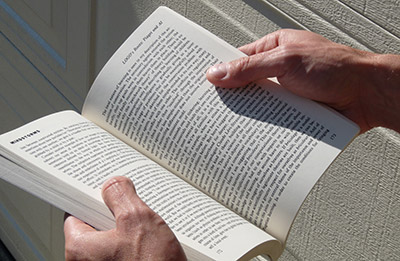
"Go ahead and pick up a book. Open it up to some page.

Notice how you know where you are in the book by the distribution of weight in each hand, and the thickness of the page stacks between your fingers. Turn a page, and notice how you would know if you grabbed two pages together, by how they would slip apart when you rub them against each other.

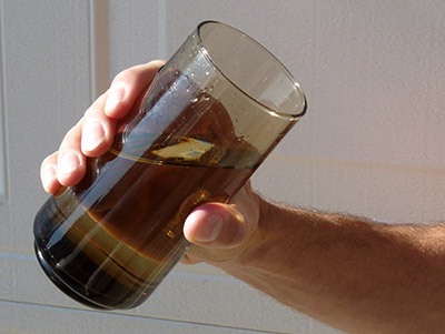
Go ahead and pick up a glass of water. Take a sip.

Notice how you know how much water is left, by how the weight shifts in response to you tipping it.

Almost every object in the world offers this sort of feedback. It's so taken for granted that we're usually not even aware of it. Take a moment to pick up the objects around you. Use them as you normally would, and sense their tactile response — their texture, pliability, temperature; their distribution of weight; their edges, curves, and ridges; how they respond in your hand as you use them.

There's a reason that our fingertips have some of the densest areas of nerve endings on the body. This is how we experience the world close-up. This is how our tools talk to us. The sense of touch is essential to everything that humans have called "work" for millions of years.

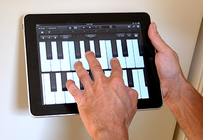
Now, take out your favorite Magical And Revolutionary Technology Device. Use it for a bit.

What did you feel? Did it feel glassy? Did it have no connection whatsoever with the task you were performing?"

Full Article:http://worrydream.com/ABriefRantOnTheFutureOfInteractionDesign/
This article was a unique look at human-centered design. Computer and electronic devices have been migrating to touch screen interfaces for the past decade, and it is generally assumed that this is the future of user interfaces. This article argues that our fingers are good for more than pointing at things, they are also good at feeling and manipulating things. If we are going to dream of ambitious future interfaces, we should aim for technologies that fully utilize our human capabilities.

Alexander McQueen Armadillo Heels


I would never, could never, wear these but they are amazing. As functional shoes, these have to rank very highly on the list of worst designs ever, but they are a complete re-imagining of what a shoe can be visually.

Miu Miu Spring 2012 Collection


I love how this collection explores the contrast between minimalism and flourishes. For example, the skirts are mostly very simple A-lines, in solid colors with a minimum of seams, but puffed sleeves and bows are also present. Some of the outfits are very monochromatic in black and grey, while the second dress, in particular, is full of colors. The very smooth, solid colored fabric is also contrasted with lace and polka dots.

The Tale of the Three Brothers

http://www.youtube.com/watch?v=hNomXoABDk4

From Harry Potter and The Deathly Hallows Part 2.

Though this scene didn't work well in the movie (the transition between live-action and animation was too jarring), it is absolutely stunning on its own. The story is told in silhouettes and shadows, and is a great demonstration the principle that less is more. The contrast between the 2D and 3D imagery is also visually striking.

Fringe

Despite what its abysmal Neilson ratings might suggest, Fringe is one of the best shows on television. Fringe follows a secret division of the FBI tasked with investigating seemingly impossible occurrences with strange scientific explanations. Many episodes center around a conflict between this universe and an alternate one, where the Hindenburg never crashed, the tragedies of September 11 didn't happen, and the fabric of reality is beginning to decay.

Everything about the show is meticulously designed. Details are very, very important in production and it shows. The cinematography is reliably fantastic every week. The music is subtle, but powerful. Symbolism and foreshadowing are used more effectively than I have ever seen on network television. The scripts (most of the time) are incredibly tight: every word is essential and likely means more than it seems. Every prop is important. The tiniest of details may be crucial more than half a season later. What makes Fringe such a great show is not the writers, the actors, the producers, composers, directors, or crew, but the confluence of all of these elements. The show does not condescend to it's audience, but displays the effects of amazing attention to detail that make every episode worthy of repeat viewing.

The Mighty Boosh

I have never really been a fan of absurdist humor until I saw this show. I've never seen another comedy quite like it. Jokes are often split, with the set up occurring at the beginning of the episode and the punchline not following until ten minutes later. Actors regularly break the fourth wall, and continuity is entirely disregarded. The narrative structure is also very strange, and changes from episode to episode. The Mighty Boosh taught me that the norms and rules of television can be broken to fantastic effect.

Bloxes


Bloxes are building blocks meant for adults, and were designed with adults in mind. Their large size makes them great for building life-size structures. They are incredibly versatile, and can even be used to build arches and other free-standing structures. Many different tech companies (Google, Mozilla, twitter) keep bloxes on hand for employees to play with as a creative outlet.

Cami Secret

As much as I do not believe that this video needs no further justification, this product seems to encompass all of the hallmarks of a bad design. First and foremost, it solves a problem that does not need to be solved: camisoles are not nearly as troublesome as this video suggests. It also solves the "problem" inefficiently and inelegantly.

Apartment Dishwasher

I despise the dishwasher in my apartment. It's racks are the most irritating that I have ever seen, severely limiting both the number and type of dishes that it can be used to clean.
Exhibit 1: The Top Rack
Bowls go in the middle, facing each other like soliders at war and wasting room that could be used to fit two additional bowls. I know that it was done so that it would be easier for the dishwasher to clean the bowls, but I have never seen another dishwasher with this set-up, and they all worked well enough. The racks for the cups are also unnecessarily wasteful. Eight bowls and 12 cups is the entire capacity of the upper rack.

Exhibit 2: The Bottom Rack

An enormous hub in the middle of the bottom rack means that only small plates can be placed in the center rows in both front and back as regular plates don't fit. Also, the silverware holder is part of the bottom rack, while the empty space on the inside of the door is wasted.

Dishwashers are one of the most energy- and water-intensive appliances in the house. THey should be loaded efficiently and run only when necessary, but the poor design of this diswasher forces us to run it at least one extra time per week.

Thermos Intak Water Bottle


After quite literally years of trying to find a well designed water bottle, I finally was introduced to the Thermos Intak. I hate buying bottled water and like to have a drink with me in class, so I tried at least six different water bottles from freshman to junior year. All of them were terrible- they leaked water everywhere. The worst offender was the Rubbermaid Chug bottle, which once popped open in my backpack and drowned my TI-89. Either the mechanism holding the bottle shut was too weak, or the seal between the bottle and the cap was inadequate in every water bottle I tried. The Intak does not suffer from either of those problems.
A rubber gasket insures that the fit between the bottle and the lid is tight. A rubber stopper ensures that no water can leak from the mouthpiece, and the clear plastic lid is solidly held down by two different mechanisms to ensure that it doesn't open by accident. I can throw this bottle in my backpack with my laptop and papers without worrying about leaks.
It is also high capacity while maintaining a reasonable size, as well as easy to grip.

Microsoft Zune Device Interface

The video above demonstrates everything that I love about the Zune firmware.
The first thing that I love is the "twist" interface. It eliminates the need for excessive menu drill-down. For instance, to switch from an artists menu to a genre or album menu, it is necessary to go "back" and select the desired sort method. On the Zune, you just swipe across the screen. The metaphor expands from "backwards and forwards" to "up, down, left, right," presenting new possibilities for how options and information can be displayed.
The very best part of the Zune interface though, is the use of text. For instance, at 0:14 in the video above, faint text can be seen underneath the album artwork and song title. This is a list of upcoming songs. Tapping this list causes it to display full-screen, where a song can be selected. The text above the album artwork is interactive as well. Tapping the artist name brings up that artists profile: albums in your collection by that artist, a list of albums available for purchase, pictures, a biography, even a list of similar artists, all in a "twist" menu.
The home screen has two faces, a typical list of media categories (music, movies, podcasts, apps) and the quickplay menu (now playing, recently played, recently added, and "pins" or any items that are frequently used).

MAE 377 Chimney Cover


The project that I was assigned in MAE 377 was a chimney cover that would keep warn air inside of the house, keep rain outside of the house, and could be easily opened of closed. The first step of the design process was to figure out a non-powered way to hold the chimney cover open. My eventual solution used tension and gears to move the chimney cover into the open position and to hold it there. My next steps involved a great deal of sketching. I made rough sketches of how the overall device would work in order to figure out what components would be necessary, and then sketches of each component. Finally, once I had a general idea of components and their dimensions, I began drafting the project in PRO/E, which was a very helpful way to verify that all of my dimensions had been calculated properly.

Doctor Who Freezer Paper Template


Freezer paper can be used as a low-tech screen-printing method. Basically one-sided wax paper, freezer paper can be ironed to fabric (without damaging the iron) and then later peeled off, cleanly and easily. It makes a great quick, low cost stencil.

This is the stencil that I created for a Doctor Who-themed t-shirt. With separate photos of the Doctor, the TARDIS, and K-9 from the internet, I used Photoshop to strip each image down to a silhouette, then combined them and washed-out any areas of overlap. Once this image was printed, I traced the outlines onto the semi-transparent freezer paper and cut out areas that I wanted painted with an Xacto knife. The freezer paper was then ironed onto a t-shirt and painted over. Once the paint was dry, the paper was peeled off, revealing the design below:


"Through The Viewfinder" Apparatus


"Through the Viewfinder" is a photographic technique that uses two cameras (a modern digital camera with manual focus and an old twin-lens reflex camera) to take images with vignetting and distortions.

The Kodak Brownie Reflex: a vintage twin-lens reflex camera

The vintage camera is aimed at the subject, and the digital camera is used to capture the scene through the viewfinder of the old camera. About 1.5 feet is required between the cameras, and it must be completely dark in between them, so that the only light that the digital camera senses comes from the viewfinder. As so many different vintage cameras are used with so many different digital cameras, it is necessary to design and build a special apparatus for each particular combination of cameras.
I designed two different styles, for use in different situations. One made of rigid cardboard, for when I don't need to worry about carrying it, and another made of opaque polypropylene, for when I can't carry much or will be near water.

The cardboard design was the most difficult to get right, as my camera (a Kodak Brownie Reflex) has a complicated shape.


A raw photo taken through the cardboard apparatus

The polypropylene design (at home, so I can't take a picture of it) has an elastic seam on either end (made from rubber bands) that ensures a good seal around both cameras. The flexibilty of the polypropylene comes at the expense of being very difficult to use, as it will often bend and obscure the viewfinder, and both cameras need to be individually supported.


Radiolab: Me, Myself, and Muse


http://www.radiolab.org/2011/mar/08/me-myself-and-muse/

The episode of Radiolab that this segment is taken from is all about making deals with yourself. In the clip above, Jad and Robert talk to psychologist Oliver Sacks and author Elizabeth Gilbert about their struggles with the creative process.
Oliver Sachs discusses a time when he was working on a book and was having a terrible time with writers' block. In keeping with the theme of the episode, he solved the problem by making an unimaginable bargain with himself: If he didn't finish in ten days, he would commit suicide. Though he is unable to say whether or not he would have actually gone through with it, this literal "deadline" as he describes it, created a powerful imagined threat that got him writing, first out of necessity then out of a creative well he had not known existed. He describes a "wonderful associative engine" in his head that made writing the book feel like taking dictation. This story was shocking but humorous and well-worthwhile look taking desperate measures to encourage creativity. It found an analog in the way one of my friends described her creative process- purposefully leaving projects until the last possible moment so that she has no chance to second-guess herself.

Next, Elizabeth Gilbert talked about her attempts to "live a lifetime of creativity without cutting your ear off." She described the anxiety she felt when working on a book to follow "Eat, Pray, Love" and her fears that she would never be able to surpass her first novel. She recounts interviewing Tom Waits who believed that there were different ways songs came into the world: "songs you have to sneak up on like hunting for a rare bird," "songs you find little bits of like pieces of gum under a desk," "songs that need to be bullied" This was the first time that she had ever thought of inspiration as an it, something that can be distanced from oneself and negotiated with. This is a radically different view of creativity than the prevailing wisdom, and was a neat idea to toy with.
get distance from it, negotiate with it


Swingline Compact Stand-up Stapler

Although I own this stapler in a somewhat more subdued black and grey, it is a joy to use. I believe it is well-designed because
  • It can stand on one end to reduce the amount of space it takes up on your desk.
  • It is solidly built, heavy enough to feel substantial and sturdy enough to get through more sheets of paper than it would appear capable of.
  • A gauge on the back of the stapler indicates roughly how many staples are left so it is easy to see that it is getting low.
  • The rubber, ergonomic grip on the bottom makes one-handed stapling easy.

Radiolab

Radiolab has taught me about the power of designing experiences. Every segment is carefully edited and produced to bring the audience along on an adventure. It is hard to describe, but the sound design adds an entire dimension to the interviews and dialog and adds so much more than just music or traditional sound effects. The breathtaking attention to detail on the show results in a listener experience unlike any radio show I've ever heard.


Cities


The Good Show

Lost and Found

Desperately Seeking Symmetry

James Gurney: The Idea Monster


"Instead of just doing a straight architectural portrait, I wanted to come up with a clever idea for a fantastical sketch. But my mind went blank, as if some monster robbed all the good ideas out of my head. Then I thought: What if there actually was an Idea Monster that stole good ideas? It would sit blocking the road, and kidnap all the fresh, original ideas that came rolling along. It would let through only the stale, tired old clichés."
http://gurneyjourney.blogspot.com/2011/11/idea-monster.html

James Gurney is an artist whom I have admired since I read the book Dinotopia in elementary school- his illustrations are incredibly beautiful. I just learned this fall that he keeps a blog where he posts sketches and watercolors, and have been following it through my RSS reader ever since. In early November, he posted the image and the quote above, which I thought was a charming way to think about that moment when a great idea is on the very tip of your tongue, and then is snatched away at the crucial moment, or those days when, try as you might, only boring ideas seem to come.

Janet Echelman: Taking Imagination Seriously


There were many different elements of this video that coincided with design topics that I am interested in. The first was the idea of limitations leading to innovation. Janet Echelman was in India on a Fulbright scholarship and was supposed to hold an exhibition, but her paints never arrived. She was forced to try a different medium, and as the village she was in was had a large population of fishermen, she was inspired to try to create sculptures out of fishnet. Fishnet is now her primary medium, and she has created massive sculptures for cities all over the world.


Another element of the speech that I found very interesting was her description on the fusion of traditional crafts and technology and engineering that is needed to create each sculpture. These enoromous figures needed to be modelled before they could be constructed, and special computer simulation programs had to be created in order to bring these wonderful, organic shapes to realization.


I also was very interested in what she had to say about designing for nature. Most of her sculptures are outdoors and exposed to the elements, so wind is an important consideration in each design. Response to wind is modelled for each new sculpture, so that the wind can be used to animate the netting, causing fluid motion.


Poke the Box by Seth Godin

Poke the Box was a very short book, but it once again came back the many of themes explored by Sir Ken Robinson. It talks about how the only way to make a difference or to do something great is to take a risk- to poke the box and see what happens. It encourages readers to take the initiative to stand up for their ideas and move forward, working against the desire not to take risks that has been instilled in everyone since childhood. This is an important message that I struggle with, so I use this book as a sort of self-help: tiny doses of inspiration and encouragement when I need them.

Self-Assembly

This video was very interesting as it gives a peek into a possible future. It is possible that one day, humans will be designing machines or buildings that can construct and repair or even replicate themselves.
This article discusses further uses for self-assembly not touched upon in the video, including drug delivery mechanisms.

Monday, November 7, 2011

Sterillite 3 Drawer Cart


I have been using these carts for storage for the past four years, and they drive me just as crazy now as they did at the very beginning. The drawers slide easily, until they are filled. The plastic frame is too flexible and begins to collapse, exerting pressure on the drawers and making them very difficult to move in or out. The weight limit that allows the cart to remain fully functional is unrealistically small. Even loosely filling the drawers with clothes or other lightweight objects prevents the drawers from opening and closing properly.
In addition to being too weak in compression, the frame is also too weak in tension. The plastic frame is made of three separate components which stack and snap together. These snaps are very weak, and often the frame will fall apart if lifted, even if all of the drawers have been removed.
The design does not adequately consider that users will be filling the drawers, or will ever need to pick up the cart.

L.L. Bean Personal Organizer

This is my single favorite piece of luggage.


I am allergic to nearly all soaps and shampoos, so all of my toiletries have to come with me whenever I travel. Most toiletries bags aren't large enough for this, and are little more than a rectangular soft case. Until I found this bag, Ziplok bags were the best solution that I had found, as they were large and their transparency made it easy to locate items. This bag, however, if perfect. It is large enough to hold everything that I need and has enough pockets and pouches to keep everything organized. Large bottles each have a compartment in the main body of the bag, while small things like makeup and spare contacts can be placed in smaller pockets. The bag folds up flat enough to be placed in a suitcase. Another great feature of this bag is the hanging hook. When the bag is opened, a hook swings out and can be used to hang the bag in the hotel bathroom or another convenient location to keep everything at hand and countertops clear.


2007 MacBook Body

I always thought that my MacBook was part of a strange batch where something went wrong. From about three months after I bought it, small chunks of plastic started to break off of the body, bit by bit.
Like this.
Or like this.
Unfortunately, this was not an isolated incident at all. The plastic of the upper keyboard case is too thin and weak and snaps off when pressed down against the harder outer shell. The problem is especially common for people who carry the computer in a backpack, as pressure on the closed case forces the shell and keyboard cover together. It is a shocking lack of durability for a computer which is otherwise so well designed and engineered. Mine has handled multiple tumbles without a single problem, but is falling apart because I carry it to class in a backpack.